

 |
 |
|
|
|
#1
|
|||
|
|||
|
The new Qantas branding was just posted a few minutes ago, https://twitter.com/qantas/status/791423064718188545
New Qantas font and redesigned Red Roo to suit the Dreamliner (reason for the rebrand) QPJ A330 is the first aircraft to have the new rebranding https://twitter.com/flightradar24/st...23851565637633
__________________
Robert Myers Photography - Aviation Spotting Australia Flightradar24 feeder (F-YSWG1 & T-YSWG2) FlightAware feeder (YSWG/6482) |
|
#2
|
|||
|
|||
|
Qantas reveals new livery and logo
http://australianaviation.com.au/201...very-and-logo/ Explains QPJ mystery trip to VCV |
|
#3
|
|||
|
|||
|
I've been a little out of the loop of late, but, did anyone see that coming? I'd not heard any rumor and innuendo about it at all?
Cheers M
__________________
http://flightdiary.net/MarkG |
|
#4
|
||||
|
||||
|
It was a really well hidden secret.
Sent from my SM-G935F using Tapatalk
__________________
Recent Flights: 26/10/24 QF1511 (YQS) 26/10/24 QF1504 (YQS) 26/10/24 QF1503 (YQS) 26/10/24 QF1500 (YQW) 14/10/24 QF1270 (X4A) 11/10/24 JQ655 (VGF) 29/09/24 QF1501 (YQS) 29/09/24 QF1562 (YQS) |
|
#5
|
|||
|
|||
|
I've gotta say when I first saw the new branding, I loved it. But the more I see it and think about it, it seems that they've overdone the new 'roo. They've removed its paws and for many around the world it may not be instantly recognisable as a kangaroo.
|
|
#6
|
||||
|
||||
|
Yes I agree that with every tweak of the livery, the kangaroo looks less and less like a kangaroo.
However, I like the grey stripe. |
|
#7
|
||||
|
||||
|
The new standalone logo looks quite good but on the aircraft? To be honest I''m not too sure what to make of it. I do like the silver tones on the rear fuselage and on the kangaroo. Not happy with the amputated roo. I'm glad the kangaroos are only on the inside winglets and not outside. The titles are a bit meh it took me a while to get used to the '07 titles but I did grow to like them, maybe these will too. I'm in two minds about the engine logo. On one hand the two tone red looks really good but it's bit garish maybe if the stuck with the reshaped triangle logo similar to the engines on the' 84 and '07 design and at similar proportions it would look better. I love how the incorporated the retro roo roundel into the livery. It reminds me of Air France and how they retained their flying seahorse logo in some form throughout their livery redesigns. Having said that I feel the aircraft name in retro font clashes with the rest of the titles. Maybe if they moved the roundel from the nose and had a black and white retro roo roundel on the engines instead of the red roo it would look better.
Anyone know how many aircraft are still getting around in the '84 design?
__________________
2012 FLIGHTS 26JAN QF501 BNE-SYD 73H VH-VXK // 26JAN QF2010 SYD-TMW DH3 VH-TQE // 30JAN FQ606 TMW-BNE J41 VH-TAH // 01AUG DJ1384 BNE-ADL 73H // 11AUG DJ1407 ADL-BNE E90]/ |
|
#8
|
|||
|
|||
|
|
|
#9
|
||||
|
||||
|
Qantas "New Era" Livery & Dreamliner Next Generation Cabins
Qantas launched their "New Era" livery on Airbus A333 VH-QPJ this morning, with the aircraft arriving from Kona as QFA6004, and then being towed into Hangar 96 for the launch by Tug Blue Delta. The Next Generation cabins for the Boeing B787 Dreamliners were also on show, with Business and Economy seat pods setup for inspection. Livery Differences: New font used for the Titles, Aircraft Name & Retro Qantas Kangaroo logo on nose, full kangaroo on the engines instead of the red triangle, Kangaroo on the inside of the winglets, different Airbus A330-300 titles and logo, silver stripe in front of the red on the lower fuselage, wing like silver flash on the new stylised Kangaroo. Here are some images from today's launch. 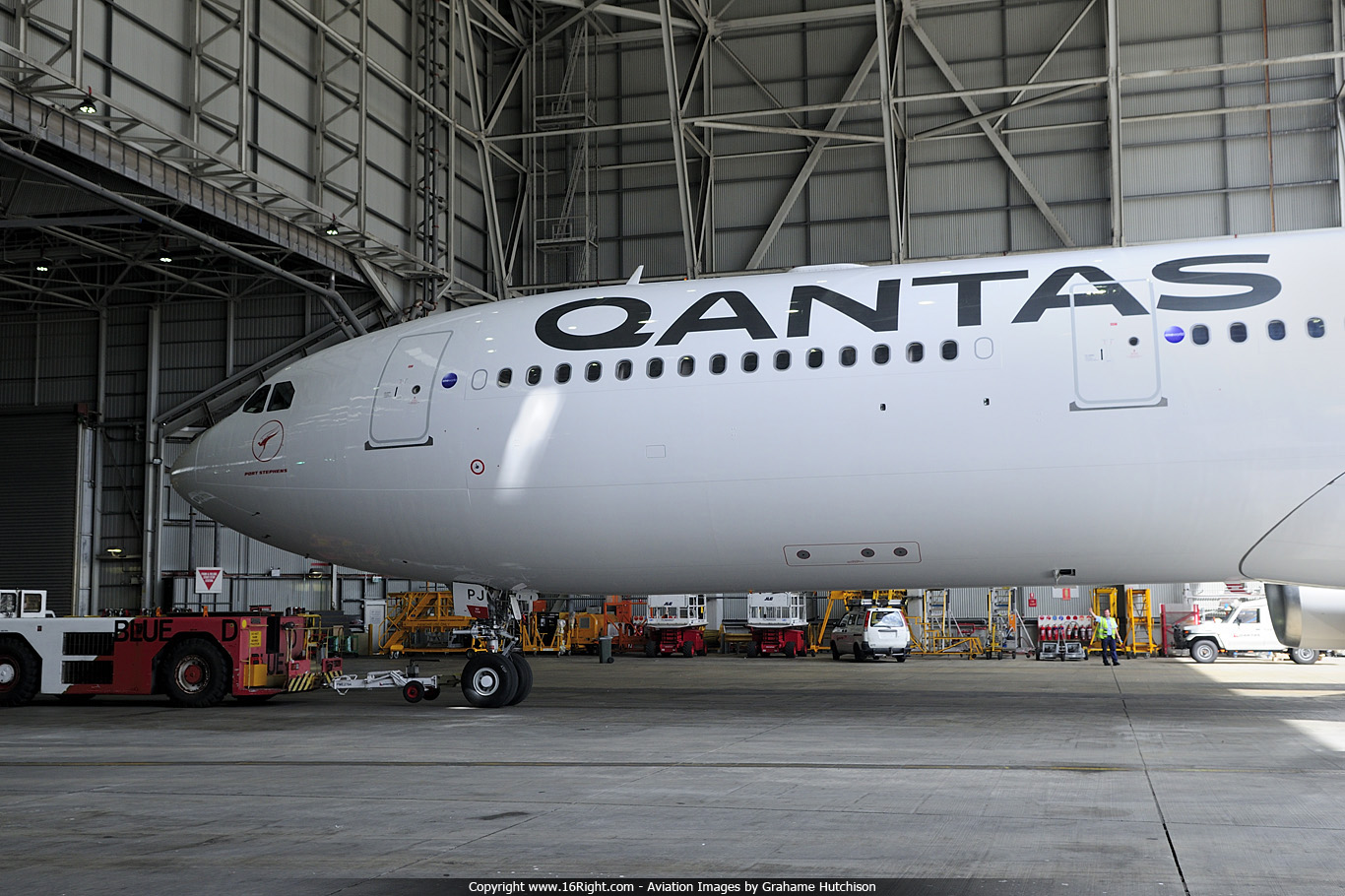 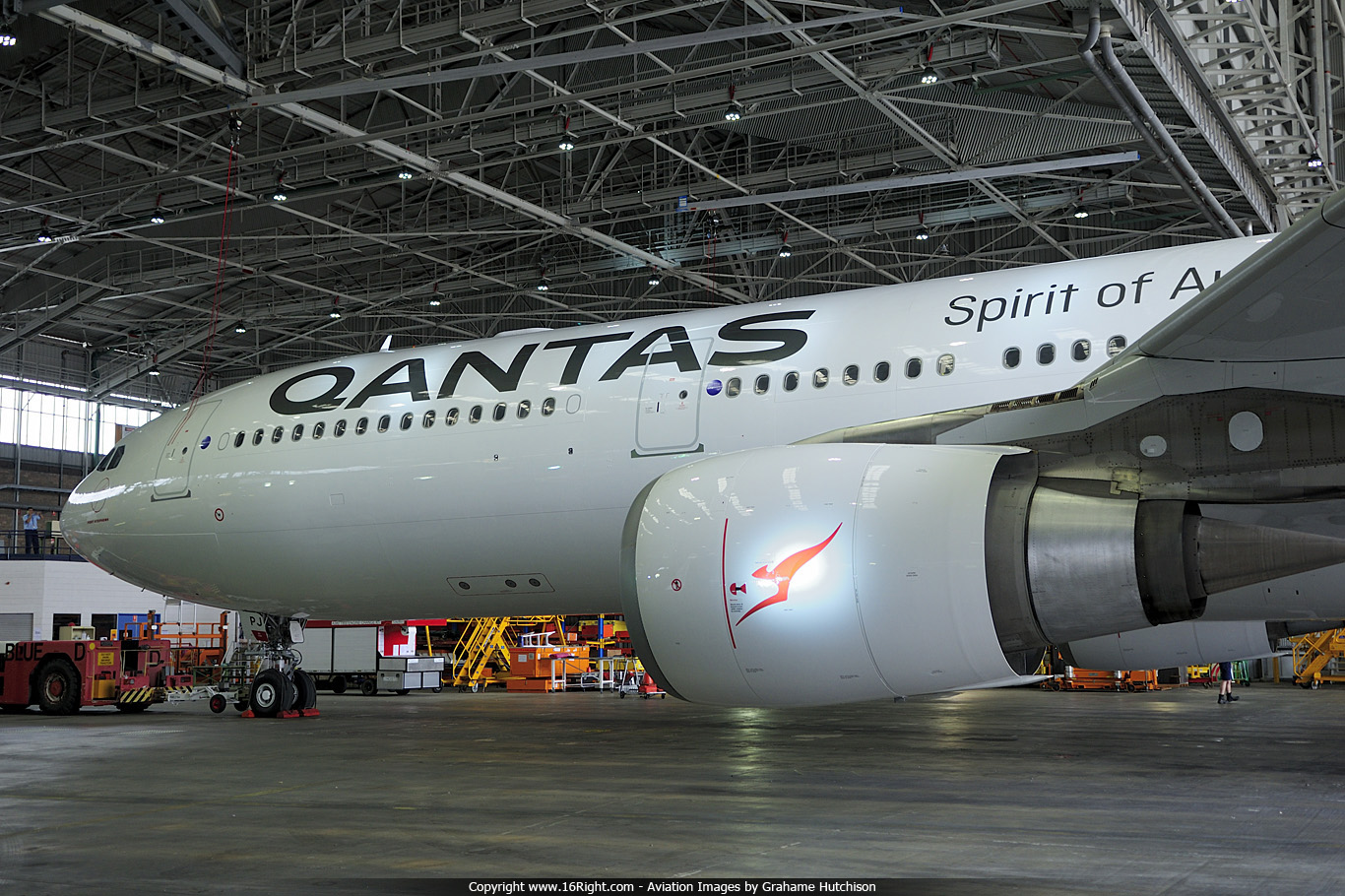 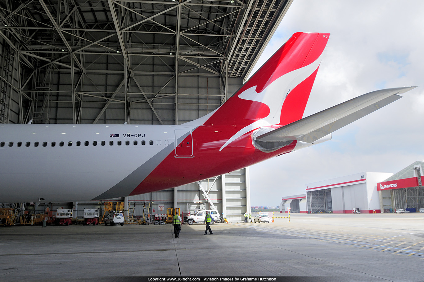  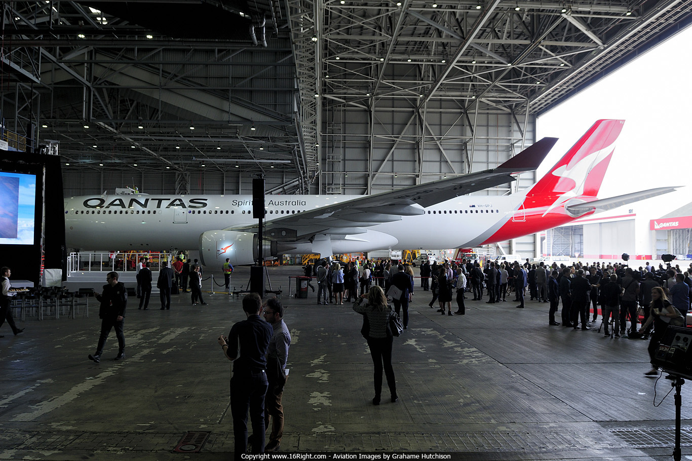 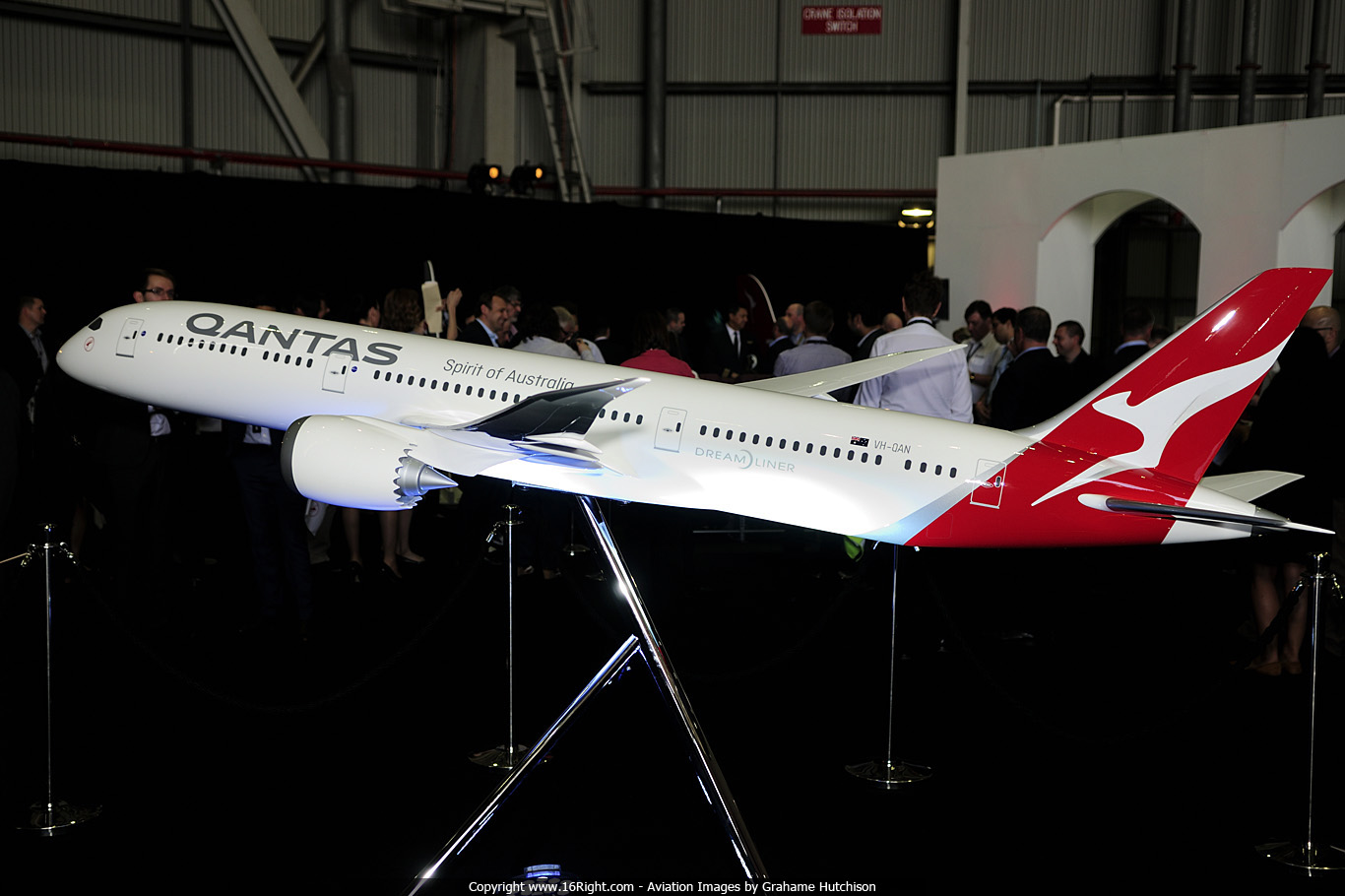 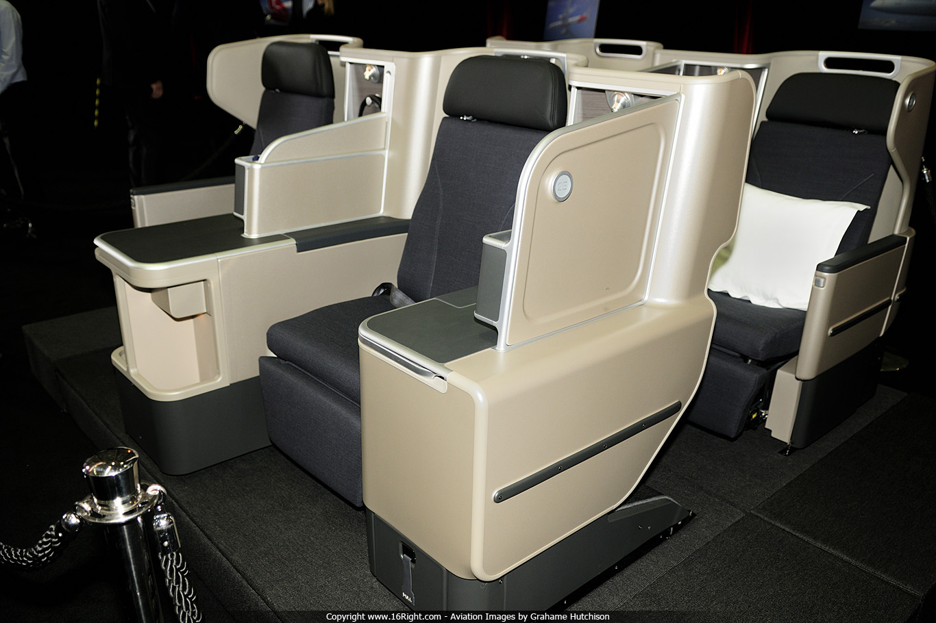 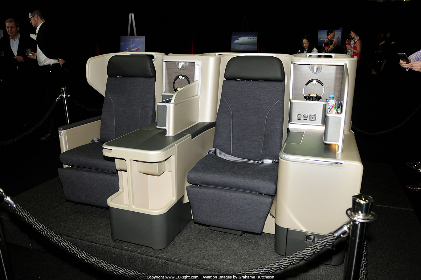 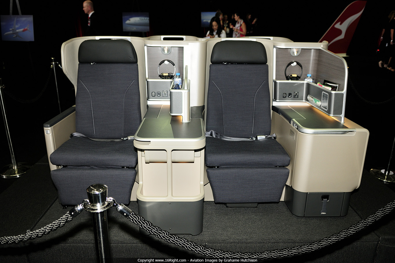 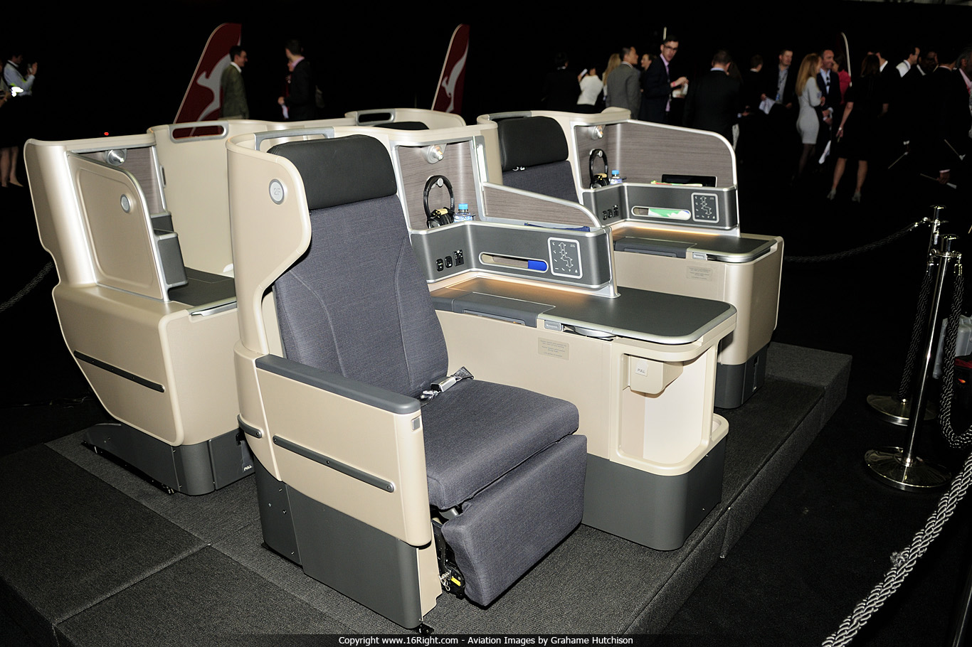 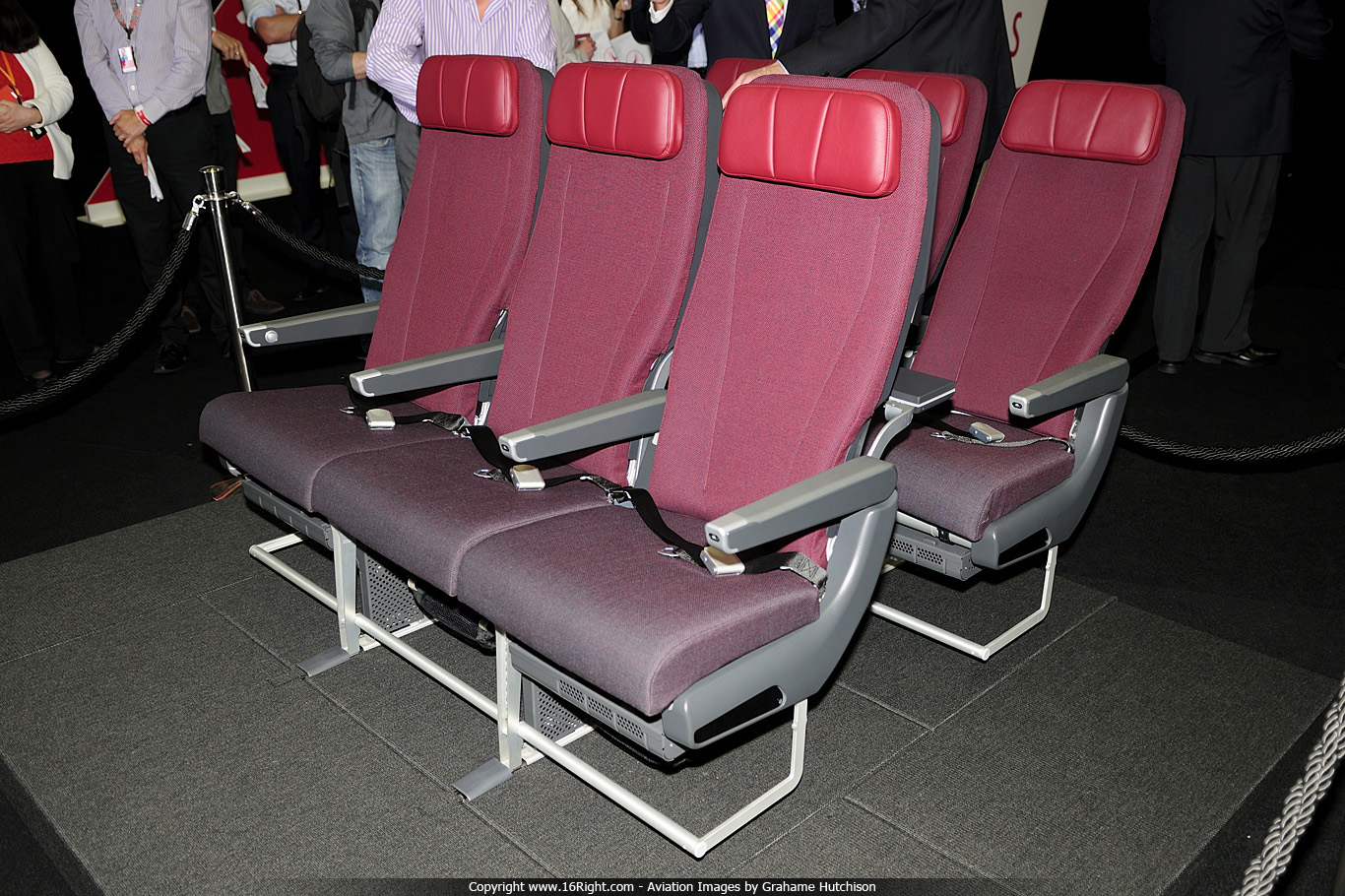
__________________
Joined 1999 @www16Right FlightDiary Airliners Web QR Retired PPL C150/172 PA28-161/181 Pitts S-2B SIM: 12Hr QF B767 B744 CX B742 Nikon D100-D200-D300-D500 |
|
#10
|
||||
|
||||
|
a good comparitive
__________________
used to fly globally on business, now retired |
 |
|
|